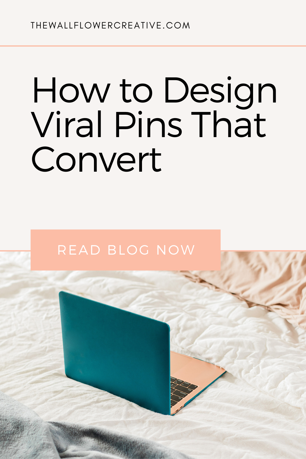
How to design slay-worthy pins that convert

What is it about Pin Design?

So I know I’ve talked about how AMAZING Pinterest is for converting traffic to your website in my previous blog posts, but today I want to share some special tips with you wallflowers on one way or more of getting more web traffic & that is through pin design.
Since Pinterest is a visual platform, pin design is the main key to getting viewers attention. So what if you're not a designer? Don’t worry if you're not because by the end of reading this post you’ll become a fully fledged pin design wizard. If you’re on the other hand, then this should be a fairly simple but a very informative read for you.
Whether you’re a designer or not the real problem you should really be focusing on is every business in your niche does pin design. So how do you stand out from the crowd?
Well, that’s why I’m writing this blog post to not only teach you the constructions/anatomy of a pin but also how to put all the key points given in this post together to help you create slay-worth pins.
So without further ado.
Does size matter?
To answer that question in short, yes it does.
Would you say a giraffe & a monkey are the same size? Of course not! If you do, then I definitely recommend you got to Specsavers to have your eyes checked immediately. But you see my point.
If your pins are of various & crazy sizes, your layout is just going to be messy & confusing to a viewer visiting your profile. In fact, I can say yes you’re standing out from the crowd, but not in a good way.
Here’s an example of that:

So what measurements do you need & why do you need those exact sizes?
Measurements
According to Pinterest the best size your pins should be is 1000 x 1500 px which is 2:3 aspect ratio. But the minimum a pin should ever be is 600px x 900px. If you want a longer pin (like a tall infographic), then you can go up to 1000 x 2100 px.
But do be wary when making infographic pins that it doesn’t look cropped on the “Smart Feed” a.k.a the home page before you click on a pin. If you want to avoid cropping, then try 600 x 1260 px.
Personally, I use the 1000px x 1500 px, but I find that a lot of people find other sizes work better for them also.
So I say the best thing to do is, play about with the sizes & see which ones get the most engagement over time. That way you’ll know which ones work & which ones don’t.
Why does text matter?
Because at the end of the day, yes we all like pretty pictures but, your pin isn’t going to matter if there is no message to go along with it.
So what size should your text be & what font?
Well, the size depends on how big your pin image is & what software you're using. Here below is an example of what it should & shouldn’t look like:

As you can see one is way to small that I bet you had to physically bring your face closer to your screen. Whereas the other you could clearly see straight away & understood exactly what the pin is about in a matter of 5 seconds. That’s what you want.
You’ll also notice that the font typeface is really simple & easy to read. That’s also something you want to take in consideration when designing your pin.
Also, think about using branded fonts that you use throughout your business. It’s a great way for people to recognise not only your pin design but your brand straight away.
What colours work for my pins?

Again you want to be using not only your branded fonts but also your brand colours throughout all of your pins as well. You want to make sure you keep all your pins branded as much as possible, so viewers will automatically know who you are at the sight of a pin.
You should also consider that pins with a mixture of dominant colours are reported to get 3.25 re-pins than pins with one single dominant colour. So if you have room to fit another colour on your pin alongside one of your branded colours then make sure it's dominant.
I also highly recommend using white space in your pins and focusing on using bigger and bolder text when you can as they stand out more. I’d even try typographic hierarchy too as the most viral pins usually do.
Do this especially if your brand colours are quite light & neutral. After all, we want your pin to stand out not fade in the background.
What about stock photos?

The 3.25 rule also applies to stock photos but not as major. You want to keep your photos bright but with a contrast of dominant colours as well. No one likes dull photo’s so make sure they have some colour & that they're upbeat.
You also want to make sure that they are of good quality, clear & don’t have too much going on. The last one is especially important.
Why? Because when it comes to adding font on your image, your pin is going to look like there is too much going on, which will put viewers off. You definitely don’t want that.
I highly recommend using flatlay stock photos that have a lot of white space as I’ve found they tend to be quite successful pins on Pinterest.
I also suggest that you start using a mixture of flat-layout photos, lifestyle photos & portrait photos. To get free stock photos, I recommend Pexels or Unsplash. If you want more exclusive pictures that are not overused & unique, then read this post to find out more - 7 websites with the perfect stock images for your pins (that aren’t over used)
The Transparent layer
One thing you should also note is that sometimes your stock photos can be quite light & if your font colour is light as well then viewers won’t be able to read it. So a neat trick I do is, I add a transparent layer. Now, you're probably thinking what is that?
Well, my friend, it's the answer to all your font problems. A transparent layer is a dark layer that goes on top of your stock photo but underneath your font. Here is an example of what I mean:

You transparent layer doesn’t have to be a dark/grey-ish colour but it preferable.
Adding a CTA (Call To Action)
First off I want to say the most important part about your pin is your web address. How else are people supposed to know where to go?
So when adding your web address, you want it to be either at the top or bottom of your pin. You also want to make sure that it’s a good enough size for people to read.
As for other CTA’s, people forget or often don’t know that they can also post freebies alongside blog posts. Pinterest is made to inspire people to take action, so why not advertise your e-books, checklists & so forth.
What you need to be doing is designing covers for those freebies or if you already have a blog post that includes a freebie add a little example on your pin cover for that blog post, of what the viewer will be getting. For example:

Youtube videos
I was recently asked by someone is it fine to be uploading Youtube videos to Pinterest & why aren’t they playing?
The answer to that is, yes! There are two ways of doing this. One is you can upload your MP4 file as you do on Youtube to Pinterest. From there, all you have to do is link that video to Youtube & voila!
But there is another way you can show off your Youtube videos & that is to create a normal pin graphic & link that to your Youtube video. So all you’ll need to is, design a pin cover that has a title of what your video is about, same as you do with your blog posts & your web address. Then link it to your video & bada bing, bada boom one youtube pin to go!
I also suggest adding an example of your Youtube video on your pin cover like the example above with the freebie.
Keywords
Last but not least you want to make sure your pin is searchable & to do that you need keywords. Keywords are what tell Pinterest what your pin is about. So you want your image to be fully optimised as possible.
When you’re saving your pin you want to AVOID the standard file name.
For example:
Standard file name: IMG_0985.jpg
Optimisied file name: designtips-graphicdesigners-webdesigners
This way Pinterest can not only understand what your pin is about but, it will also rank it higher when someone searches for one of the three keywords we used in the file name.
If you want to learn more about SEO on Pinterest head on over to my other blog post on 10 ways you can SEO proof your Pinterest.
You can also get your hands on my free Pinterest keywords checklist when you sign up for my newsletter below. This will help you locate the right places where you need to be putting your keywords & improve your SEO.
So what now?
You’ve now learned how to be a fully-fledged pin design wizard! Yasss! But the journey of learning doesn’t quite end there my friend. You may have more knowledge & a lot more confidence in pin design, but now you need to put it into practice!
That’s right! Now it’s time for you to start creating viral-worthy pins. So what are you waiting for!? Go forth & finesse all your designs all over Pinterest.